

An early prototype for OSAS, rendered by yours truly...
As far as my original scratchboard cover is concerned, there were flaws in my pre-publication assumptions; but there were also benefits. In the "con" category, I now think that my intentionally primitive rendering comes off more as grotty and amateurish than as the purposely antediluvian novelty that I'd hoped for. Like that old, beat-up nightstand you might find at any garage sale versus the intentionally-stressed unit fresh from the manufacturer, value results in what the market thinks -- not what the seller anticipates. Don't get me wrong, I haven't heard a single comment either way from any reader or critic about the aesthetics of the early cover. This is wholly my own determination. But, here's something for those of you who purchased one of these two editions: Because they are now out of production, they will likely be worth a whopping few bucks over the cover price in, say, about a thousand years.
I'd also originally considered the hard reality that having my book catching someone's eye on a bookstore shelf was to be a non-issue. You see, P.O.D. (Print on Demand) books were -- and to great extent, still are -- the bastard children of the publishing world; and nobody wants to advertise the back-alley infidelity of using non-traditional publishing techniques (and side-stepping the fat-cat traditional publishers), especially when the book merchants' monetary return for a P.O.D. book is mere pittance anyway. Makes sense. Indie authors as myself may not like it, but it's basic economics -- and economics drive the marketplace. Because of printing costs -- and the fact that I have a substantially thick piece of fiction (with accumulative cost-per-page fees) -- I could hardly afford to give merchants the 40% wholesale mark-up they crave, because I would price myself right out of the market. With the Third Edition, however, I've been able to broker a better deal in printing costs, which means that bookstores may theoretically be more willing to gamble on housing my book in their brick & mortar establishments. And that's where, happily and sadly, a super cover can make all the difference. Unfortunately, it's all moot anyway, since brick & mortar stores have steadily been going by the wayside, and as far as I know, none of them ever stocked my book. Serves them right...
I'd also originally considered the hard reality that having my book catching someone's eye on a bookstore shelf was to be a non-issue. You see, P.O.D. (Print on Demand) books were -- and to great extent, still are -- the bastard children of the publishing world; and nobody wants to advertise the back-alley infidelity of using non-traditional publishing techniques (and side-stepping the fat-cat traditional publishers), especially when the book merchants' monetary return for a P.O.D. book is mere pittance anyway. Makes sense. Indie authors as myself may not like it, but it's basic economics -- and economics drive the marketplace. Because of printing costs -- and the fact that I have a substantially thick piece of fiction (with accumulative cost-per-page fees) -- I could hardly afford to give merchants the 40% wholesale mark-up they crave, because I would price myself right out of the market. With the Third Edition, however, I've been able to broker a better deal in printing costs, which means that bookstores may theoretically be more willing to gamble on housing my book in their brick & mortar establishments. And that's where, happily and sadly, a super cover can make all the difference. Unfortunately, it's all moot anyway, since brick & mortar stores have steadily been going by the wayside, and as far as I know, none of them ever stocked my book. Serves them right...

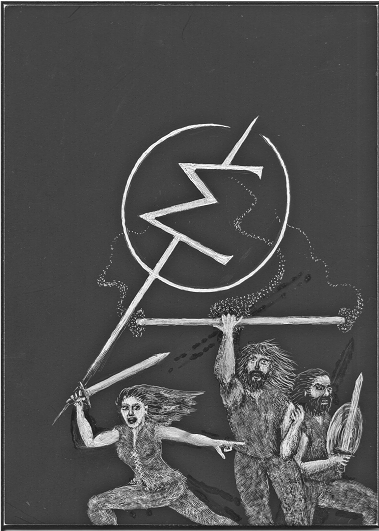
Above is a scan of my original pre-cover scratchboard art. I've deliberately kept the contrast on this scan lighter so that you can see (hopefully, depending on your monitor) where my corrections and alterations took place. Scratchboard is basically a tablet of white China clay coated with a layer of black india ink. The artist, using various utensils (blades, abrasive brushes, etc.), actually scrapes away the black to produce an image. Mistakes are easily hidden by a touch-up with india ink. It's a tedious process, but many people (all I know is that I'm not one of them) have used this method to create unique and beautiful art. Anyway, note my corrections (the re-applied ink appears darker) made to the woman's rear leg and right arm (left), the man's sword (right), and the angle of the staff (center).
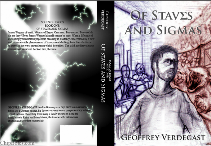
The third concept was also based on the dual worlds idea, only this time it focused on a close-up of the psychologically tormented Wagner. Where the background in the second prototype (above) centres on the beings and activities that interact with Wagner, this rendering focuses more on the environs of the two worlds that Wagner straddles. At end, we opted for less Wagner and more of his situation.
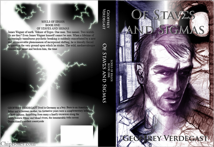
Below is the final, detailed drawing before adding colour and effecting back-cover text changes. It was a lot of fun for me, getting to see the process and putting in my two-cents with Chip whenever we hit a stumbling block. It all came about relatively speedily (he worked fast!), and I know that Chip devoted a considerable amount of effort and thought to it -- which I greatly appreciate.
Then I "met" Chip Boles, my new cover artist. A friend of mine (Jenny, that's you -- take a bow), got to know Chip when they both worked in the Japan Exchange and Teaching (JET) programme. Introduced to Chip's work (and his wit) through Jenny's encouragement and my subsequent perusing of his website, I became convinced that I needed to solicit this man for his talents. Turned out, he was game for the challenge; and the result -- in its various stages -- can be seen below. Enjoy!
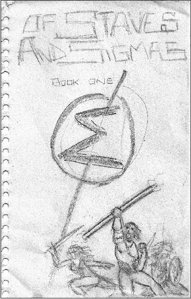
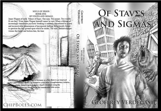
Below are the three concepts that Chip provided after he'd consumed a modest portion of my narrative for inspiration. First he sketched the wrap-around arena scene (below) based on the savage events in Chapter Sixteen. This was actually the scene that I'd first suggested he draw, not only because it was such a fun chapter to write, but because it contained the type of large-scale action that I felt would translate best to a cover. Ironically, despite its potential, we ended up not using it.
Below are the three concepts that Chip provided after he'd consumed a modest portion of my narrative for inspiration. First he sketched the wrap-around arena scene (below) based on the savage events in Chapter Sixteen. This was actually the scene that I'd first suggested he draw, not only because it was such a fun chapter to write, but because it contained the type of large-scale action that I felt would translate best to a cover. Ironically, despite its potential, we ended up not using it.
This page is going to serve as kind of a catch-all repository for everything book-related -- from conceptual issues, histories, anecdotes, prototypes, helpful tips, and any quirky little amusing thing that I think might be of interest to you.
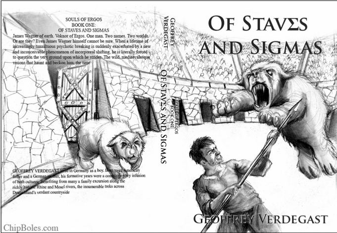
There have been three covers in OSAS's short life. This might seem superfluous, but there's a reason behind it. You see, I -- being a moderately driven control freak -- not only wished to publish a novel on my own, but I wanted to contribute as much as possible to the bigger package. One of these facets meant doing the cover art myself. Now, I'm a fair artist, but certainly not a great one; so, back in 2006, when I was putting OSAS together as a literary adventure, it was my desire to try and emulate the covers of all of those haughty Penguin Classics I'd read in college. And ultimately, that's what I based my original concept on. In the end a noble effort, yes, and although its b/w contrasts stood out among a shelf of otherwise brightly hued books, I must admit that my cover image never really resonated in quite the way that I'd hoped. Soon after, upon making some supplementary edits (for what became the Second Edition), I took this opportunity to clean up some of the imagery -- along with the additon of the new "afterword" blurb -- but at the same time I was slowly beginning to lean toward attempting to procure some truly eye-catching artwork for any further editions. This I found, in 2011, with illustrator Chip Boles. Together -- albeit half a world away -- we bounced ideas and sketches back and forth through cyberspace, and eventually settled on what we like to call the "Wagner: Dual Worlds" cover. On this page, you can see some of the processes from both my original cover, and the various covers we considered for the Third Edition.


Next, Chip offered a take on the story that I hadn't thought of: one that showed Wagner's ordeal of having claim to two worlds, but not really living in -- or belonging to -- either of them. I liked the concept straight away, and after some discussion, we decided that Chip should pursue the image from this example. Compare this sketch with what became the final cover (viewable on this website's Book One page), and you'll note the changes that Chip thought through in order to visually navigate from idea to end product. Originally portraying two of Wagner's doctors on the left, he eventually opted for only one in order to lighten the busyness in the limited dimensions that he had to work with. I also much prefer the dramatic exaggeration of the skyscraper angles in the finished product to the comparatively straight perspectives in the draft.


CLICK HERE FOR MORE FUN STUFF!